
Activation Itinerary
Client: Shiftgig Responsibilities: UX and Visual Design
About this project.
This project was in response to our client who needed a physical copy of real time event details. They currently managed a large number of events that were always in motion. This meant a roster of staff that needed to be filed in relation to an event that was worked, event details such as required outfits for staff, consumer sampling details, and miscellaneous event details. This documentation was necessary to ensure the success of past, present, and future events.
Background
As the only visual designer on our team, I was called upon to manage the visual details and UX process for this documentation. This was a visual document that would be translated to a pdf format. It would be included with other event information that was sent to the event managers.
Challenges
• This feature was not an interactive feature
• Strong visual design for optimal communication
• No previous UX processes in place

Developing the Process
The bulk of this project was figuring out how this was going to be used in the most efficient way. It needed to be designed so it was easy to reference quickly. I worked with the product team to develop UX methods that made sense for the application.
Discover.
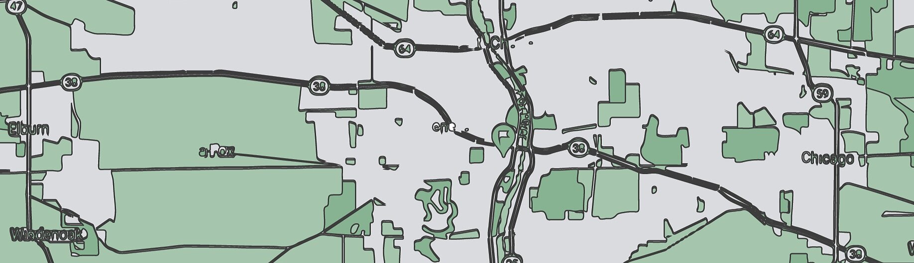
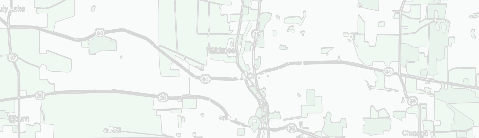
I compared current maps that displayed correlating data. I then applied this to how our users would interact with it to make it simple and easy to understand.
How this data would be used
Our client’s events were located at various liquor stores and bars across the country. Event managers had to be extremely organized to make sure everything was accounted for. Our client was always adding additional features and the major feature was multiple stops and multiple day events. The data this pdf would provide would help to keep all the events organized and on track.
The information generated from the pdf allowed us to:
• predict spending
• view event logistics
• file staff information
• monitor consumer sampling
• view drink lists
Define.
The main line of communication for the client was through the product team. Together we walked through the scope and defined the use cases so I can then translate this information to a visual document.
Defining the Use Cases
We had 2 scenarios that had to be illustrated. This document had to include the map and locations for a
1 day multi location event and an event over multiple days at 1 location.

Defining the User Stories
The primary users were the event managers. Part of their day to day tasks were to track the events that they were given to manage. They did not have anything that documented these events until we designed this itinerary. They relied on feedback from the event staff after the event had happened as their measure of how it went. The goal was to track everything before, during, and after to better predict trends.
Examples
The event manager needs to contact a worker directly to give updated information.
The event manager needs to track what samples are being given for a repeat event at a later date.
The event manager needs to send the event details to another event manager that is taking over their account.
The event manager needs a complete staff list to give to the managers at the locations where the events are being held.
The event manager needs to give copies of the drink specials to the bartenders at the event.
Defining the UI
Staff List with total number of staff
Icons for Consumer Sampling and Drink List
Details will be displayed in a multiple column design to save space
Staff List in a table format under the event details
Details of each event:
• Consumer Sampling
• Drink List
• Outfit Details
• External Notes
Develop.
I presented my design ideas to the product team. We relied on the project scope and requirements to guide us to the more effective layout.
The Initial Design
After reviewing popular map applications, I started with this prototype design. I choose a vertical layout for the information on the left, and the map on the right. This worked well initially to visually guide the viewer through the route.
The icons that I used for the first design included the location markers that were commonly used in map applications. The starting and ending flags represented the beginning and end of the event route.
The second design used numbers instead of the location marker illustration. This proved to be a better fit as there could be many locations, resulting in too many colors to coordinate. The numbers were clearer and were better for collecting the data at a glance.

These designs worked well for the initial information that was required, then we were presented with additional data that needed to be added. This resulted in some editing of the design.
Along with what we already had we also needed:
number of shifts/roles per location
total number of hours event staff will be working per location
In the final design, I flipped the map up to the top and listed the verbiage below.
This gave us more room to add information for each location and/or event as needed.
Deliver.
I worked with the development team that would be generating the data that would be inserted into the pdf document. The blank template (key) was the master template for the different versions that would be needed. The map is now located at the top of the page with the coordinating data at the bottom.


Project Takeaways
While most applications are interactive, there is still a need for keeping information physically present. This information was taken on site and used by event staff such as managers, waitstaff, and bar tenders. They may not have the time or simply have their hands full to open an app, this allowed to them to have tangible information to glance at when needed.
While working with the product team I learned how to manage large scale information into a visual format. Iconography played a large part in this project. We went through various design ideas before deciding on a final layout. This was based on a growing project scope and changing needs of our client.
Overall these documents lead to the events having a more organized timeline and the ability to physically refer to the information as needed.